Sunday, February 27, 2011

GRAPHICAL OBJECTIVES


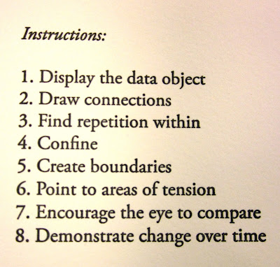
Ahoy! My first book project at The Press! Not only did I discover that I can't get enough of teal and red together, I also discovered how incredibly satisfying it is to print a book. I spent second block of this school year investigating some of the fundamentals of design, particularly digital design techniques. The majority of the block was spent messing around on photoshop and illustrator, trying some of Ellen Lupton's assignments from Thinking with Type. I also dilligently worked in a sketchbook, using a method for developing an idea that I lifted from Nadine Nakanashi of Sonnenzimmer in her artist book called Formal Additive Programs. In Formal Additive Programs, Nadine gives herself 18 Instructions: abstract verbal cues in order to proceed from one drawing to the next. These instructions include "Continue Motion & Move Freely," "Isolate, Observe and Compare" and "Listen to the Rhythm of the Patterns." Her drawings thoughtfully respond to these prompts and the book and ultimately generate a body of images that could be used as jumping off points for other projects. I found that if my initial drawing wasn't that great, it didn't matter because the third or fourth mutation was something completely abstracted from the first. For me, there was a good balance between relinquishing control, following instincts and trusting my internal dialogue.

After a few weeks of doing sets of these exercises every morning, I found a series of these that I liked enough to make into a letterpress book, hence Graphical Objectives came together. I found I was thinking a lot about graphs, maps and diagrams as visually gripping objects for their formal qualities rather than the information they conveyed. I also perused The Visual Display of Quantitative Information by Edward Tufte which discussed the theory and practice of data graphics. Here are some of the examples of my own formal additive programs from my sketchbook:


With a lot of help and patience from Aaron, I began to lay out, print and bind the book. Graphical Objectives was printed on our beloved Vandercook-219 over block break (during which I listened exclusively to Andrew Bird.) Amazingly, there weren't any huge snafus or "OH SHIT!" moments, which I had definitely anticipated. Registration, particularly on the last page was tight, but not too many pages were lost to mistakes. If I could print it again, I would err on the side of more ink and be more careful about the placement of the first page so that the teal wouldn't come through onto the fourth page.

Four months later, I am still incredibly psyched on this book and plan on making more. It was great to mail it to friends and family, and watch them read it. A lot of the recipients read the instructions, gave me a puzzled look, flipped through the book quickly, went back to the instructions and went through again more slowly. It was interesting to be able to compel almost every reader to go through it twice.

Recently, I read an essay by Karl Young, (not to be confused with called Carl Jung) "Notation and the Art of Reading" in which he discusses Aztec, Chinese and Early English ways of reading. He notes that early Chinese readers "in writing or reading poetry...tend to be much more attuned to the interworkings of sound, sight, gesture and idea. The interaction of components emphasizes continuity and versatility; a mind trained to read interwoven pictograms, graphs of gesture, phonograms and ideograms can be expected to feel a continuity between sight, sound, gesture and intellection." (Young, p. 33) This idea relates to the concept I had in mind for how readers might look at my book - written instructions that visually move from one graphic to another continuously, linking sight, intellection and intuition.

Headiness aside, I still can't beat my grandpa's comment over the phone the other day: "I don't know what it means, but I like touching it!"

Karl Joung, "Notation and the Art of Reading," A Book of the Book: Some Thoughts & Projections About the Book & Writing, ed. Steve Clay and Jerome Rothenberg (New York: Granary Books, 2000), 33

NUNZ


Commissioned by Carol Neel in the History Department at Colorado College, this poster was for speaker Mary Ann Hinsdale, professor of theology at Boston College, speaking about the disappearance of nuns in the Catholic Church. This poster was my first poster using all polymer plates, and the smallest poster I made so far. Inspired by Andy Warhol's screen print of Ingrid Bergman as a nun, I wanted to make the image of the nun as graphic as possible, and use bright colors that aren't usually associated with nuns. Another source of inspiration was typographer Isaac Tobin (an internet fav of mine) His style is simple, crisp and clear and I tried to emulate his style for the type lay-out of this poster.

During the printing process, I was a little nervous about the EXTREME VIBRANCY of the colors, and, additionally, that the colors were the exact colors of the Denver Broncos. (yikes) After the orange, blue and dark blue were printed, I wandered over to the print shop to get some other eyes on it. Luckily, Heather Oakleaus, photography teacher, was around and plopped a barbie doll down on my poster and said "throw some HOT PINK ON IT." Moral of the story: What Would Barbie Do? Go BIG or go HOME! The nuns giving the speech loved the poster and grabbed all they could before heading home.

Another thing to consider about this poster, was the fact that the nuns have X's over their eyes, and these posters were going up in churches all over Colorado Springs (again, yikes?) Although this poster could have been potentially controversial, I learned that sometimes, over-doing it works. The image is eye-catching and funny and the colors are saccharine but stand out on a busy bulletin board. If I could do this poster over, I would have built in trapping in the polymer so that slight registration errors weren't noticeable.


Friday, February 25, 2011

PEOPLE OF THE PRESS: TARYN WIENS


Name: Taryn Wiens

Year of graduation: 2014

Major/Minor: Studio Art/ Museum Studies

Where are you from? All over (Oregon most recently)

How long have you been working at the Press? Since fall 2010

Briefly describe what you do at the Press:
I print posters, help with workshops, and do personal printing and book binding projects.

What brought you to the Press?
Book Arts/Letterpress summer class (highly recommend it!)

What keeps you coming back?
The awesome crew that works here, a need for inky hands, a desire to continuously learn more about bookmaking and letter-pressing, and the beautiful dualistic nature in the practicality and pointlessness of it all.

How has working at the Press enhanced your overall education at Colorado College?
It’s one thing you can learn at CC that is not purely conceptual. It’s like the shop class that I never had. To do real things with your own hands is so satisfying.

How would you like to see the Press grow and change in the future?
I’d love to a) see more students get involved...it’s such an amazing resource but too many people don’t know about it and b) see it produce more quality artistic works and make a really strong name for itself in the larger letterpress community which of course depends on a), student involvement.

PEOPLE OF THE PRESS: ELEANOR ANDERSON


Name: Eleanor “Bone-saw” Anderson

Year of graduation: 2012

Major/Minor: Studio Art, Minor in the Book

Where are you from? Cleveland Heights, OH

How long have you been working at the Press? 3 years

Briefly describe what you do at the Press:
I primarily make posters, books, and other ephemera and have recently started a press with Lucy Holtsnider called Iron Cupcake Press. A lot of the time I drink coffee, listen to Andrew Bird, and think about what to do next.

What brought you to the Press?
When I was a freshman I saw all the posters around campus and had to learn how and where they were made. Then I took a class called Basic Graphics and made my first poster for the Aspen bike trip (6 colors, with a broken leg I might add)

What keeps you coming back?
The smell of solvents in the morning, all the sharp equipment, definitely setting type… oh and, the people!

How has working at the Press enhanced your overall education at Colorado College?
I want to work as a letterpress printer after college, so working at the press has not only provided me with the technical skills needed for this, but also turned me on to a community of interesting people, working all over the country, geeking out over the same thing.

How would you like to see the Press grow and change in the future?
In a manner similar to Danish astronomy icon Tycho Brahe, I would like the Press to gain feudal power over an island, commission its own castle complete with paper mill and printing press and become the unrivaled authority on subjects such as taming tigers, bedtime stories and dinosaur management.

PEOPLE OF THE PRESS: BECCA LEVI


Name: Rebecca Levi

Year of graduation: 2011

Major/Minor: Art Studio (Environmental Issues)

Where are you from? Boston, Massachusetts

How long have you been working at the Press? Since mid-junior year.

Briefly describe what you do at the Press:
I print posters for the Sound of Colorado College Student Radio station events, including student band and visiting artist live shows. I have also done various editions for CC Farm club events and opportunities, and other CC events.

What brought you to the Press?
A love for workmanship and craft. Immediately I was fascinated by the intimate relationship between a printer and her work. I had done many other forms of printmaking before, but letterpress presented a whole new world of understanding. The technical aspects and true sense of patience that letterpress demands are challenging and continually fascinating to me. The sense of respect that I have for other printers and the community that I feel I am now more a part of is also something I think brought me to the Press, and will keep me printing for the rest of my life.

What keeps you coming back?
What I said above sums it up pretty well...but besides the passion and fascinations, there’s always the deadlines.

How has working at the Press enhanced your overall education at Colorado College?
Time spent at the Press allows me to use my hands in a way that most classes do not. Though I am an art major, and am working with my hands a lot, there is a meditative and calming aspect to letterpress printing that has allowed me to be a more aware student and member of the CC community. However, I must say that printing can also be stressful--yet without those moments of stress I would have less appreciation for times of calmness and would probably get a lot less done. Letterpress has taught me about time management, stress management, working with other people to meet a deadline, learning how to be a better teacher and mentor, and learning how to work in harmony with the other printers in a small(ish) space.

How would you like to see the Press grow and change in the future?
I would love to see the Press grow to be something that the whole CC community knows about. Much of the time, people don’t know that the posters they see are letterpressed by hand, and it would be great to spread that basis of knowledge about the medium throughout the campus--not only so the printers can be more recognized--but so that we can share this awesome tradition with others who value hand made things. I am really looking forward to seeing the apprenticeship program flourish, and am loving seeing the classwork that gets done at the press. It would be super cool to see students hanging out at the Press that aren’t just printers...students who want a nice place to do work or hang out with a printer-friend. Mostly, I would like to see the press integrated into the CC students database of cool places on campus, because it really is one of the raddest places to be.

Thursday, February 24, 2011

FUNK FACE AT THE CARRIAGE HOUSE

For this project, I made an edition of 31 posters, 10"x 20". The event is a student band (FUNK FACE!) playing live at the Morreale Carriage House on Friday the 25th at 10pm. Sponsored by The Sound of Colorado College Student Radio Station.
Above: Top: Printing the first color, and essentially laying the foundation for the poster in red. Photo taken by my assistant--Daniel Alvarado.
Above: Bottom: Printing the 2nd color: brown. On the left is the lock down on the press bed, on the right is the product hot off the press.

Carving for the third run. This is mid-carving, when I was done the block looked mostly lighter--this was in an attempt to shade the edges of the lines with the third color (dark purple) to add depth and movement.


Playing around with margin size and formatting. So many choices! Final poster is the one on the far right.
Above: all three stages of the poster. From right to left you can see the red, brown, and finally the purple phases of the image. This poster was done using linoleum blocks, and utilizes what is called a 'reductive' printing process, this meaning as I printed each run (or in this case, each color) I carved away more and more of the block. You can see in the first few images, I started out with solid red blocks to lay a base color, and then in the sixth image, that I was on my second stage of carving. There is one sentence of type at the bottom, set by hand in Nubian typeface, size 14, which was printed on the third run in purple. So in between each run, I went back to the carving block and changed where the press was going to lay down ink--for a grand total of three runs and two carving sessions!

CULTURE, SOCIETY, AND HISTORY: CULTURES OF THE BOOK (4)

After we had the general plan for the project together, the next step was for the pairs to choose a specific topic (something that we covered in class that they wanted to learn more about) and begin researching it. After they had gathered information, they needed to do two things: 1) construct a visual representation of the information that they wanted to communicate, and 2) write a textual explanation of their topic and image.

The process of making the images was interesting and challenging, as the majority of the students (all but one, really) had little or no experience with art and design. I told them to use whatever methods that they felt comfortable with—drawing, collage (analog or digital), tracing, etc. Most of the groups ended up using a combination of those three methods. Some used an entirely digital collage approach, and one pair drew their image entirely by hand.

The images that follow are the scans of the originals that the students turned in.


"The Library of Alexandria," by Alex McConnell & Andrew Salazar


"The Warring States Period," by Yuchen Zhao & Will Harris

"The Story of Boudicca," by Sonora Miller & Lizzie Hunt

"Libraries Through History," by Max Perryman & Linda Jimenez

"Pokemon and The Classic of Mountians and Seas," by Catherine Zaumseil & Jeffrey Collett


"Robin Hood, Through the Ages," by Rebecca Smith & Peter Elliott

"The Book Burning of the First Emperor of the Qin Dynasty," by Bobby Meller & Mariel Dempster

Wednesday, February 23, 2011

CULTURE, SOCIETY, AND HISTORY: CULTURES OF THE BOOK (3)

One of the major difficulties of collaborative projects, where many different people are contributing images, is to bring the whole thing together visually. We knew that our “map,” with images from 7 different groups of 2 people, would look pretty crazy when it was all jammed together on the same surface. We took a cue from the historical images that we were looking at (by Johannes Buno, see the post below) and realized that we could bring the disparate images together in two ways: 1) by using a unifying image underneath (which was kind of the point of the thing in the first place), and 2) by “flattening” the images through technique and color. They were all, of course, going to be letterpress printed (from photopolymer) but we worked them over digitally to sharpen and flatten the images into solid colors. We also decided to add a second color, to accent and articulate each image. The same second color would be used in all of the images, over the entire map. We chose not to make the films for the second color digitally, but to use hand-cut rubylith stencils.


One of the students, Sonora Miller, drew our dragon image. It combines aspects of both eastern and western dragons. The dragon would cover the entire surface of each side of the map, but reversed on the second side so that the two images would back up correctly, and the smaller images and text would be on the same place on the dragon on both sides.


We wanted to make the map big (roughly 20” x 27.5”), print it on the big press (a Vandercook Universal IV), and then have it fold up into a smaller booklet. The only problem with that plan was the size of our platemaker, which is only 11” x 17”. Nothing like a first project to run into every possible logistical problem that could come up….

Friday, February 18, 2011

CULTURE, SOCIETY, AND HISTORY: CULTURES OF THE BOOK (2)

Almost immediately upon my arrival here at CC, discussions began about what sort of Press project could be done with the Cultures of the Book FYE. The class had run before, in a slightly different incarnation (as just a Western history of the book) and the students had made, of course, a small (and very beautiful) book based on research that they had done in class. As we brainstormed ideas for the project this time around, someone (I think it was Steve Lawson) suggested doing some sort of map. We decided to go with that.

Shortly after that a friend of mine told me about a book called Cartographies of Time, which was a history of graphic representations of time. Intrigued, I got a copy through the library here (I love being a library employee) and after flipping through the book I discovered the image below:


Here is the background info, from Cartographies of Time:

[…] In the second half of the seventeenth century, as the possibility of fixing the Creation, the Flood, and the founding of Rome to rigorously established dates seemed to recede, some chronologers transferred their ingenuity entirely to the pedagogical part of their enterprise: to fixing the traditional set of dates that schoolboys had to master to images so memorable that they would become unforgettable. Johannes Buno […] devoted himself for half a century to devising textbooks that wrapped the standard narrative of ancient and medieval history in striking images and coded cues to short texts. History, he explained, was a vast ocean, and the student needed proper navigational equipment in order to avoid shipwreck. Ideally, he explained, the student would memorize “the whole order of time, as it were, reduced into a single body and set out in particular periods or segments, and whenever important events were mentioned, he would immediately be able to work out to which period or segment they belong.”
Buno had just the graphic tools for the job. For the four millennia that stretched between the Creation, in 4004 BCE, and the coming of Jesus, he found four comprehensive images: an eagle, a set of planks, a camel, and a dragon. Each image summed up a vital aspect of the millennium it stood for (the planks, for example, referred to Noah’s ark, and the camel to the camels on which the Jews made their Exodus from Egypt). But each also provided a vivid, memorable background, on which Buno placed images of important men and women. […] [1]

Here are some more examples of Buno’s images, also from Cartographies of Time:


The dragon was a particularly resonant image, because it is important to both Eastern and Western cultures, though it has very different meanings in each. The next questions were structural: how could the project be organized so that it could connect with the interests of every student? How could it be built textually and graphically for each student to play an equal role in the production of the final piece? The solution that we arrived at was this: the map would fold into segments, creating “natural” divisions of the image similar to the numbered sub-sections of the historic dragon image. The students would work in pairs, and each pair would get one section to fill. Each group chose a subject covered in class that they wanted to explore in more depth. They did research and gathered information, constructing mini-narratives of different events, personages, and institutions throughout history.

Then they needed to figure out a way to graphically represent those narratives. Their images would be printed on one side of the map, and the text they wrote (and set) would be printed on the other side, directly behind their image. But how were we going to bring all of these different images, and styles of images, together?


1. Anthony Grafton and Daniel Rosenberg, Cartographies of Time (New York: Princeton Architectural Press, 2010), 89 – 93.

Monday, February 14, 2011

CULTURE, SOCIETY, AND HISTORY: CULTURES OF THE BOOK (1)


Now it’s time to really get this new blog started. And we’re a little more than one busy semester (my first) behind. We will start where I did, with a First Year Experience course (or FYE, as we call it in the biz) called Culture, Society, and History: Cultures of the Book, taught by Professors Carol Neel and John Williams, both from the History Dept., with assistance from: Jessy Randall, Curator and Archivist of Special Collections, Steve Lawson, Humanities Librarian, and myself.

[A quick aside, for those of you not familiar with the way that Colorado College works—we don’t operate on semesters. We use a system called the “Block Plan,” where students take one class at a time, 5 days a week, for 3 and a half weeks. Yes, it’s intense. The FYE classes, like the one being described here, run for two consecutive blocks, so seven weeks.]

This was a long and busy class, with regular sessions here at the Press. I documented it all pretty thoroughly, from our initial “getting acquainted” workshops through to our big project. In order to cover it in a way that makes sense and is digestible I will be breaking things up into multiple posts. But we will start at the beginning, with that all-important document—the syllabus. Here is the official class description:

This two-block course will explore the ways in which ancient and subsequent European and Asian peoples have read, copied and used writing from the origins of script to the contemporary electronic book. The course's central readings will be major sources in the development of Western and Chinese civilizations. Attention to these works from both ancient and more recent pasts will stress the ways in which culturally normative texts both reveal and critique the power of the manuscript and printed word. Further readings by modern historians and critics will explore the book-making technologies known to historical readers and writers.

Students will write individual critical essays on the respective common readings and collaborate to choose, research and print in limited edition a text of significance for the cross-cultural history of the book. The faculty coordinators of this course, members of the History Department, will support students in discussion and written assignments, and Special Collections and Humanities librarians as well as the letterpress printer who oversees the Press at Colorado College will engage with students throughout, especially in preparation of their final publication. Class members will collaborate with these non-departmental experts in handling of manuscript and other primary source materials, researching these works’ contents and contexts, and producing a hand-set and hand-printed edition of the text they choose and the commentary they construct. Students will thus develop familiarity with modern research tools and postmodern critical frameworks as they enter into the experience of historians and printers of the past as well as the subjects whom their technologies of the book revealed. Although all course activities including the production of printed matter are grounded in prior cultures, their goals are contemporary: for student participants to develop awareness of the power of the written word and the indebtedness of even electronic information storage to the historical frameworks shaping literacy.

So yes, a big, gorgeous, almost overwhelming class, especially for students just beginning their college careers. But the students here are sharp, and they did really well. And we’ll see just what they did in the next few posts.