Showing posts with label Broadsides. Show all posts

Thursday, February 16, 2017

CALL FOR ENTRIES! AMPLIFY & MULTIPLY: RECENT PRINTED ACTIVIST EPHEMERA

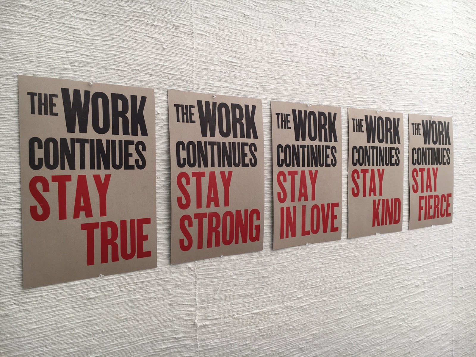
5 of 6 prints from The Continuing Project, by The Press at CC. Available here. 

CALL FOR ENTRIES! PLEASE SHARE WIDELY!
 
AMPLIFY & MULTIPLY: Recent Printed Activist Ephemera

IMPORTANT DATES:
Sign-up Deadline: February 24, 2017
Arrival Deadline: March 16, 2017
Exhibition Dates: March 27 – April 17, 2017
Reception: Friday, March 31, 2017, 4 - 6 pm
Return Shipment: April 25, 2017

AMPLIFY & MULTIPLY will be an exhibition of activist/social/political printed posters, protest signs, objects, fundraiser publications, and other ephemera, made in (roughly) the last 6 months, advocating for social and environmental justice, equality, and the rights of oppressed people. This is a show that will stand in opposition to fascism, racism, white supremacy, misogyny, and every other horrible tool that power uses to maintain its killing grip. We are looking for work that has been deployed in the real world, as opposed to being made just for this show. This show is not limited to professional artists. It is open to anyone who has felt compelled by recent events to produce and share a message in the print medium.

The show will be held in Colorado Springs, at Colorado College’s Coburn Gallery, from March 27 to April 17, 2017.

IMPORTANT: As this is a show of ephemera, we are not planning on returning the pieces. If you want your pieces returned, you must notify us in advance and use reusable packaging that includes a return shipping label. All of the work that we keep at Colorado College will be housed in a permanent archive in Tutt Library’s Special Collections, accessible to students and the general public.


GUIDELINES:
Please email Aaron Cohick at aaron.cohick@coloradocollege.edu if you are going to participate, and please also note if you can donate your pieces or if you would like them returned. The deadline for sign-ups is February 24, 2017.
  • All work must be printed (letterpress, screenprint, offset, digital, Riso, etc.). We will not exhibit hand-lettered signs.
  • Send as many pieces as you like. Multiple copies are great and will all be displayed if there is space.
  • Work should have been made since August of 2016, but that is flexible. Definitely nothing before 2016.
  • No fee. No jury. No sales. No trolls.
  • Artists are responsible for shipping costs to and from Colorado College. See “Shipping” below for more info.
  • Unframed works/objects only
  • The exhibition will be hung salon-style, using binder clips hung on push pins.
  • Objects that are not posters (like tote bags, buttons, etc.) are definitely encouraged.
  • Artwork will not be insured by Colorado College during transit or while on site.

SHIPPING:
Send work to:


Aaron Cohick
The Press at Colorado College
14 E. Cache La Poudre St.
Colorado Springs, CO 80903

Please write “Amplify Show” on the labels or packages.

REMINDER: If you want your pieces returned, you must use reusable packaging and include a return shipping label.

CONTACT:

Aaron Cohick, Printer of The Press at Colorado College 
aaron.cohickATcoloradocollegeDOTedu

From A People's Curriculum for the United States, by Cuneiform Press

Wednesday, February 27, 2013

JESSY RANDALL: HOW YOU LOSE


And here’s another one! This time only dating back to the first semester of the current academic year (what can I say, we’ve been busy). How You Lose, by Jessy Randall. The colophon (printed on the back) reads:

“ ‘How You Lose’ is a found poem by Jessy Randall.
The source text is Ken Uston’s 1982 book Score! Beating the Top 16 Video Games.
This broadside was instigated by Shanon Lawson, designed by Steve Lawson, and realized by Aaron Cohick at The Press at Colorado College in September of 2012. Letterpress printed from photopolymer plates on Rives BFK, using fluorescent inks and two rad fonts downloaded from the Internet: Synchro LET and 04B_21.”

Copies are still available: $20 plus shipping. If you are interested in purchasing one, please email Aaron Cohick, Printer of The Press at CC, at aaron[dot]cohick[at]coloradocollege[dot]edu.

Tuesday, February 26, 2013

NOEL BLACK: WATCHMEN IN THE RYE


This broadside is from about a year ago, but now we’re finally getting it up online. The colophon (printed on the back) reads:

“This broadside was designed and printed by Aaron Cohick, with assistance from Matvei Yankelevich, at The Press at Colorado College, for the occasion of Noel Black’s reading as part of the Visiting Writers Series at Colorado College on April 5th, 2012. The poem originally appeared in a chapbook, Moby K. Dick, and a full-length book, Uselysses, both published by Ugly Duckling Presse in 2011. The artwork for this broadside was adapted from the graphic novel Watchmen (written by Alan Moore and drawn by Dave Gibbons), published by DC Comics in 1986. Printed from lead type and photopolymer plates on Rives BFK in an edition of 40.”

Yes, it’s all letterpress.

There are some more copies for sale. The cost is $20 plus shipping. If you’d like to purchase one, please email Aaron Cohick, Printer of The Press at CC, at aaron[dot]cohick[at]coloradocollege[dot]edu.

Wednesday, October 19, 2011

AMITAVA KUMAR: from BOMBAY-LONDON-NEW YORK


Text by Amitava Kumar, from his book Bombay-London-New York.


The colophon, printed on the back, reads:
This broadside was designed and printed at The Press at Colorado College for the occasion of Amitava Kumar’s reading as part of the 2011 Visiting Writers Series. The footprints were made by our brave printers-in-training: Tara Mullin, Leeds Mallinckrodt-Reese, Patrick Lofgren, Michaela Davies, Rebekah Barnett, Emily Michels, and Sydney Minchin. The rest was printed using less pedestrian methods—photopolymer plates for the text and collagrpah for the white shapes. The typefaces are Palatino Linotype and Placard Condensed, and the paper is Rives BFK Heavy Cream. Designed and printed by Aaron Cohick, Printer of The Press at Colorado College, in October of 2011.

And there is an addendum to that as well: Alena Ede and Alexandria Romo assisted with the letterpress printing.

9” x 13.25”. Variable edition of 30. Signed by the author.

The price of the broadside is $20. To purchase a copy please send a check for $25 ($5 shipping), payable to Colorado College, to:

The Press at Colorado College

Aaron Cohick

14 E. Cache La Poudre St.

Colorado Springs, CO  80903

Be sure to include what you are ordering and your shipping address. Questions? Email Aaron Cohick at aaronDOTcohickATcoloradocollegeDOTedu.

Friday, August 26, 2011

“POETRY HAS LEFT THE POEM” BROADSIDE: PHASE DELAMINATION

The other big “?” of this project was the delamination: a process of cutting into (but not through) the sheet of paper and peeling away its surface. I have done a fair amount myself (in books and broadsides) but I have never asked anyone to help me (though I have taught it and seen those students succeed at it). But it is tedious. And strange. And this was the first large project that I was asking my new apprentices to help with. I would not have been surprised had there been a mutiny. One mistake I did make in planning was not realizing how slow the process goes when someone is first learning. But our brave crew stuck to it, and we completed the edition.


“POETRY HAS LEFT THE POEM” BROADSIDE: PHASE COLOPHON

The explanation really doesn’t require an explanation:


This was printed centered, towards the bottom of the reverse side, in 12 pt. Centaur.

“POETRY HAS LEFT THE POEM” BROADSIDE: PHASE TEXT

After the image was complete, the next step was to print the text over the image, so that the outlines to delaminate would already be on each print. Like the image, the text had to be printed in two sections:


[A brief aside: Some of you printers out there might be wondering why a plastic-backed photopolymer plate is mounted on a magnetic base (made for steel-backed photopolymer). Because those are the bases that we have. We do have one Boxcar base, but it’s only a 9” x 12”. We have the advantage of having two presses with adjustable beds, so the plates can easily be raised to the proper height. We have also stuck pieces of paper under the magnetic bases to raise them up on the non-adjustable presses. So those magnetic bases are still useful, even if you’ve switched entirely to plastic-backed plates.]

I first tried printing the text in opaque white, because I was afraid black or another color wouldn’t have enough contrast. I was wrong. Here’s what the white looked like:


So black again, and it worked much better:


“POETRY HAS LEFT THE POEM” BROADSIDE: PHASE K


And then “K” for the key color, in this case (as in most cases) black.


In the two images below, the top image shows the top half of the print without the black layer, and the bottom half with. The black becomes just enough of a presence to provide the structure of the image. The second image shows the top half of the print with the black layer.


And somehow that full image is also this:


Wednesday, August 24, 2011

“POETRY HAS LEFT THE POEM” BROADSIDE: PHASE M


And then, you guessed it, magenta! The difference between the yellow+cyan and the yellow+cyan+magenta is extraordinary.


Tuesday, August 23, 2011

“POETRY HAS LEFT THE POEM” BROADSIDE: PHASE C

And then the cyan. The image started to come through, but the color still looked rather bizarre….


“POETRY HAS LEFT THE POEM” BROADSIDE: PHASE Y


And of course another thing was that I had never attempted a CMYK letterpress print before. But I figured this was a good chance to experiment, as the fidelity of the final image wasn’t going to matter. The important thing was for the remaining areas to have that CMYK dot pattern.

So I jumped right in.


And it quickly became clear that four-color process printing was mostly a matter of faith. I decided to match the ink to the Pantone swatch and hope for the best.


“POETRY HAS LEFT THE POEM” BROADSIDE: DESIGN

This summary is not available. Please click here to view the post.