
This semester I got to print my first poster, ever, at the press. (!) It was for Steven Hayward's literature class in Canada this summer. I printed seventy posters (with some extras) in four runs using three colors. I set 'KEEP EXPLORING' in wood type, which I'd never used before but always wanted to. I set it to touch the edges of an 11x17 inch poster. The rest of the text I set in lead type, Times New Roman and Goudy. To keep the ink levels consistent I printed the large type in one run and the small type in the next run. To frame the text from the top and bottom I used a reduction linoleum cut mounted on wood. Using pictures of Canada mountains I carved two mountain skylines, printed them in blue, then carved the skylines of Toronto and Montreal and printed them in green.
I used the Asbern press, the smallest one we have. It caused some momentary stress when I started printing the green skyline and realized the packing (which backs the paper as it runs through the press) was dropping off an inch before the end of the poster...you can't actually print all the way down the press bed on that press because the packing ends well before it. I fixed the problem by cutting the block with the linoleum in half (it was originally mounted on one block of wood) and moving the bottom block up by about an inch. The poster ended up being a little shorter than I had planned, but it's not very noticeable and doesn't really take away from the poster as a whole I think.

First and second runs

Third and fourth runs
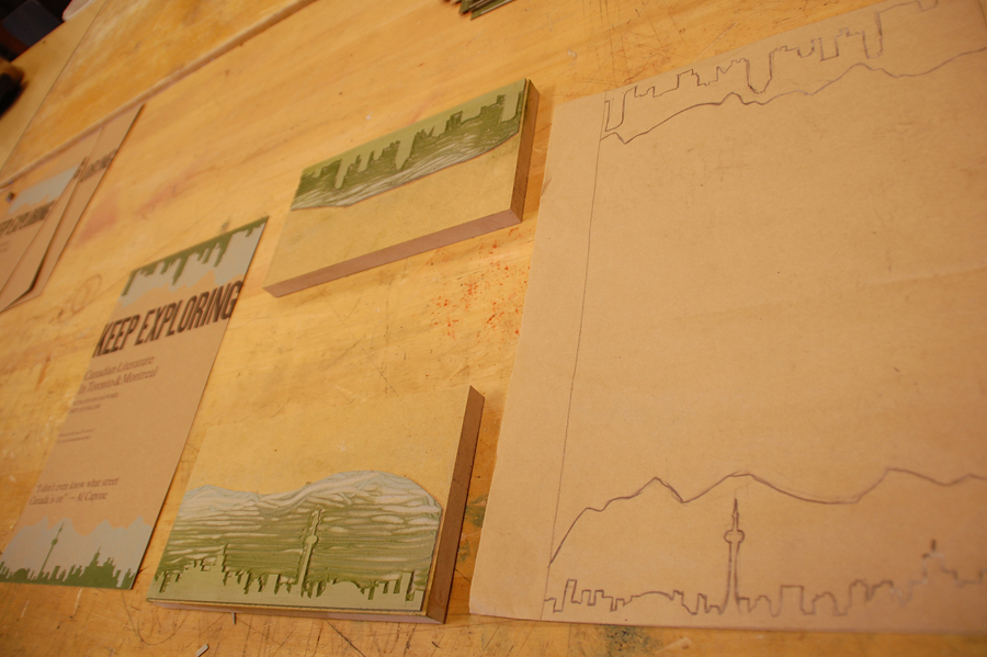
Final poster, linoleum cut, original sketch
If I could do the poster over, I would switch to a bigger press and definitely set the chunks of text moving from left-aligned gradually to right-aligned to better activate the inside space of the poster. I would also use less fonts. I think it went well though, for my first poster. I'm excited to do more!
No comments:
Post a Comment