Showing posts with label English Dept.. Show all posts
Showing posts with label English Dept.. Show all posts
Wednesday, February 27, 2013
JESSY RANDALL: HOW YOU LOSE
And here’s another one! This time only dating back to the first semester of the current academic year (what can I say, we’ve been busy). How You Lose, by Jessy Randall. The colophon (printed on the back) reads:
“ ‘How You Lose’ is a found poem by Jessy Randall.
The source text is Ken Uston’s 1982 book Score! Beating the Top 16 Video Games.
This broadside was instigated by Shanon Lawson, designed by Steve Lawson, and realized by Aaron Cohick at The Press at Colorado College in September of 2012. Letterpress printed from photopolymer plates on Rives BFK, using fluorescent inks and two rad fonts downloaded from the Internet: Synchro LET and 04B_21.”
Copies are still available: $20 plus shipping. If you are interested in purchasing one, please email Aaron Cohick, Printer of The Press at CC, at aaron[dot]cohick[at]coloradocollege[dot]edu.
Labels:
Broadsides,
English Dept.
Tuesday, February 26, 2013
NOEL BLACK: WATCHMEN IN THE RYE
This broadside is from about a year ago, but now we’re finally getting it up online. The colophon (printed on the back) reads:
“This broadside was designed and printed by Aaron Cohick, with assistance from Matvei Yankelevich, at The Press at Colorado College, for the occasion of Noel Black’s reading as part of the Visiting Writers Series at Colorado College on April 5th, 2012. The poem originally appeared in a chapbook, Moby K. Dick, and a full-length book, Uselysses, both published by Ugly Duckling Presse in 2011. The artwork for this broadside was adapted from the graphic novel Watchmen (written by Alan Moore and drawn by Dave Gibbons), published by DC Comics in 1986. Printed from lead type and photopolymer plates on Rives BFK in an edition of 40.”
Yes, it’s all letterpress.
There are some more copies for sale. The cost is $20 plus shipping. If you’d like to purchase one, please email Aaron Cohick, Printer of The Press at CC, at aaron[dot]cohick[at]coloradocollege[dot]edu.
Labels:
Broadsides,
English Dept.
Monday, September 5, 2011
FLASH FICTION (3)
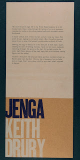
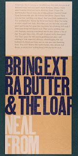
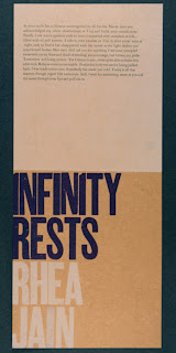
And the broadsides. All of these were printed on chipboard, in 4 colors, out of a combination of lead and wood type, and a photopolymer plate for the white solid. 7” x 16”. Each was made in an edition of 30. The last one, by Charlotte Salley, ended up on Rives BFK, because somehow we ended up short on the chipboard version.
Looking at them together, you can get a sense of how the “modular design” worked. Every piece had a general place, and then we played a bit with the composition on the press. Planned yet improvisational. It all actually went very smoothly—the only real problem we had was some badly damaged type that one or two were set with.
Looking at them together, you can get a sense of how the “modular design” worked. Every piece had a general place, and then we played a bit with the composition on the press. Planned yet improvisational. It all actually went very smoothly—the only real problem we had was some badly damaged type that one or two were set with.
Labels:
Class Projects,
English Dept.,
Ephemera,
Penny Press
FLASH FICTION (2)
And here’s the book. The covers were designed by Eleanor Anderson and were letterpress printed form photopolymer plates. The interior pages were laser printed. The paper was from the French Paper Company. All of the books were pamphlet stitched by hand by the class. We made 100+, so everyone in the class got five, and then the Press had extras.
Labels:
Class Projects,
Eleanor Anderson,
English Dept.,
Penny Press
FLASH FICTION (1)
[Today is the first day of the 2011-2012 academic year here at CC. But I am still catching up on last year’s goings on….]
In Block 4 of last school year The Press worked with Aubrey Hirsch’s Flash Fiction class. Going in, we knew that we were going to make something, but what, exactly, would be up to the students. The Twiction project (see posts below) provided the bar. I personally really enjoyed the very public broadside aspect of that project, so I was thinking along those lines at the beginning. Another thing that made this class special was that one of our Press Deputies, Eleanor Anderson, was in the class, and her presence greatly expanded our Printer Power.
The printers were many, the fiction was extremely short, and our ambition was high, so we went big: 16 individual broadsides plus one book in an edition of 100. A week to print all these? No problem.
To make it all work we came up with a modular design for the broadsides, which would allow us to rapidly switch between different lock-ups, and would also (along with a consistent color scheme) help to unite the individual broadsides as a related group. We decided on doing titles and names in wood type (composed on press) and each student set their piece in lead, in whatever size and face they wanted (but in pre-determined line lengths).
And each student also contributed a different piece of text for the book. They decided on a title and theme and got to writing. Eleanor designed the covers. I did the page layouts, based on the design of the cover. And somehow we kept the whole thing moving and on schedule.
The professor, Aubrey Hirsch, did a broadside and contributed a piece for the book as well.
And when it was all done, the entire class got together in the morning and bound 100+ copies in about 3 and a half hours. Not bad for a group who had never really done any of this before.
And some of them got really into it. This book was made by Neal From.
The one miscalculation that we made in planning this project had to do with the distribution of the broadsides. The original plan was to put them up as a complete set in as many different places on campus as possible. BUT we finished right at the end of Block 4, immediately before winter break. And if we put them up right then, they would have been up for only a day before everyone left, and before they all would have been removed (they clean the public bulletin boards at the end of every block). But we all agreed that, yes, we would put them up first thing in Block 5. And of course that never happened. So much changes over that winter break. But lesson learned: always build distribution time into a project. Or bite the bullet and let them live for just one day. It is ephemera, after all.
Labels:
Class Projects,
English Dept.,
Penny Press
Tuesday, August 30, 2011
BEGINNING FICTION: TWICTION (2)
And then the things themselves. We letterpress printed the covers from photopolymer plates (as shown in the post below), and digitally printed the pages. We chose the typeface Georgia because it is a text face designed for the screen that still looks great in print. The books were pamphlet stitched by the students. Somewhere around 60 copies were made—3 for each student plus extras for the archives. Below are some images of the book and of the broadside.
The Press at CC is primarily a letterpress studio, so we definitely try to have some letterpress component in every project that we do. That being said, the focus of the class projects isn’t always on letterpress printing in and of itself (though it can be within the contexts of certain classes), but is on the production and distribution of the written/printed word and the graphic image. The point is to demonstrate the contingent, historical, and constructed nature of the printed word, and to give students the tools, through their own intimate experience with hands-on production, to critically evaluate that nature. Letterpress printing happens to be one of the best ways to connect language, the mind, the eye, and the body. It is possible that the continuing interest in the medium is (partly) because of the connections that it fosters, and the kinds of thinking that it allows.
Letterpress printing is not just a tradition to be preserved—it is a still vital medium with a living, growing history that gets richer every day.
This Twiction project is a prime example of how the things we do at The Press connect to the larger world, of how an “obsolete” medium, precisely because of its lack of transparency, can allow for direct and hands-on engagement, both with the internal aspects of a text and its external life in the world.
Labels:
Class Projects,
English Dept.,
Penny Press
BEGINNING FICTION: TWICTION (1)
When last year’s visiting Press lecturer, Darren Wershler (see the posts below for the project that we did with him) gave his talk, he brought up many interesting and provocative ideas in regard to the future of the book and various forms of web-based publishing. He talked about writing constructed through the use of Google and other software, QR codes, and Twitter and other social media, and how these new modes of textual generation and distribution are affecting the practice and role of writing.
Shortly after that lecture, Steve Hayward’s Beginning Fiction class, who had been at the lecture and participated with other parts of Darren’s visit, came to The Press to learn and do a project. They decided that they wanted to respond to Darren’s lecture somehow, to use it as the basis for whatever they did at The Press—a little old + new media.
They had already written some Twitter-length fiction (Twiction: stories containing no more than 140 characters—an extreme, media dictated form of flash fiction) and wanted to use that as the text for the project. But how could Twitter and letterpress printing fit together? The answer came in the most ubiquitous link between the physical world and the web: the QR code. The printed QR code could literally be the (hyper)connection between the physical mode of text distribution (a book) and the electronic mode of distribution (in this case, a Twitter account set up to publish their Twictions). Scanning the QR code took a reader to the Twitter page of the class. The QR code became both the aesthetic and the conceptual driver of the project.
[Aside: one of the central tenets for structuring these class projects is that the students are given as much control and ownership as possible—both what to do and how to do it. I always give feedback on their ideas and help to guide them in terms of what is possible and what is feasible, but ultimately these Penny Press projects are conceived and executed by the students.]
We also decided to augment our hyper-project with that oldest form of social media: the letterpress printed broadside. We designed a poster that was made up of the QR code, the Twitter URL blind stamped at the bottom (for those without smart phones), and the actual text of the Twictions, also blind stamped, printed directly on top of the QR code. The blind-stamping allowed the QR to remain functional. These broadsides would be hung all over campus, with no explanation beyond the information encoded in them, as a real world, guerrilla expansion of the project.
Printing the QR codes on the book covers.
Blind stamping on the book cover.
The polymer plate for the QR Code.
Printing the QR codes on the broadsides.
Labels:
Class Projects,
English Dept.,
Penny Press,
Printing,
Process Notes
Wednesday, August 24, 2011
DON'T BE AFRAID, CANADA
Here's a fun video about CC professor, friend of The Press, and author Steven Hayward's new novel Don't Be Afraid and the Giller Prize. Canada, take notice!
Labels:
English Dept.,
Friends
Tuesday, March 1, 2011
KEEP EXPLORING
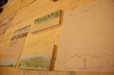
This semester I got to print my first poster, ever, at the press. (!) It was for Steven Hayward's literature class in Canada this summer. I printed seventy posters (with some extras) in four runs using three colors. I set 'KEEP EXPLORING' in wood type, which I'd never used before but always wanted to. I set it to touch the edges of an 11x17 inch poster. The rest of the text I set in lead type, Times New Roman and Goudy. To keep the ink levels consistent I printed the large type in one run and the small type in the next run. To frame the text from the top and bottom I used a reduction linoleum cut mounted on wood. Using pictures of Canada mountains I carved two mountain skylines, printed them in blue, then carved the skylines of Toronto and Montreal and printed them in green.
I used the Asbern press, the smallest one we have. It caused some momentary stress when I started printing the green skyline and realized the packing (which backs the paper as it runs through the press) was dropping off an inch before the end of the poster...you can't actually print all the way down the press bed on that press because the packing ends well before it. I fixed the problem by cutting the block with the linoleum in half (it was originally mounted on one block of wood) and moving the bottom block up by about an inch. The poster ended up being a little shorter than I had planned, but it's not very noticeable and doesn't really take away from the poster as a whole I think.
First and second runs
Third and fourth runs
Final poster, linoleum cut, original sketch
If I could do the poster over, I would switch to a bigger press and definitely set the chunks of text moving from left-aligned gradually to right-aligned to better activate the inside space of the poster. I would also use less fonts. I think it went well though, for my first poster. I'm excited to do more!
Labels:
English Dept.,
Poster Press,
Taryn Wiens
Subscribe to:
Posts (Atom)


