Showing posts with label Small Books. Show all posts

Tuesday, March 8, 2011

A BRIEF REVIEW OF FIVE HUNDRED YEARS OF BOOK DESIGN BY ALAN BARTRAM

A Brief Review of Five hundred years of book design
By Alan Bartram

In his book, Five hundred years of book design, Alan Bartram performs a critique of the canons of typography, aiming to “look at books a fresh through the eyes of a 21st century designer” (9). One of the first things a reader scrutinizes when reading about book about book design is the book itself. The book is tall and narrow, typeset in Monotype Fournier and published by Yale University Press. Bartram emphasizes over and over in his essays the importance of deliberate use of space and consequently leaves generous margins around the text body on three sides (surely not intended for marking up with notes?) The book is pleasurable to hold and easy to visually digest, and provides a unique and snarky commentary on the history of typography.

Bartram briefly describes the history of printing and then proceeds to launch into a cynically disdainful critique of famous printers, typesetters & designers. Bartram displays a photograph of a book layout on each page, describing its designer, location, year and size and then opens fires on its obvious shortcomings. Sometimes he applauds small details, but more often than not, various page layouts are, “dreadfully dense,” “downright ugly,” “full of follies,” “unexpectedly poor and…wretched” and even goes as far to say that typographer W A Dwiggins “seems unskilled in the use of space – rather a handicap for a typographer” (182). Oh snap! He states in his preface that printers in history have ignored form and function, careful layout, and a plethora of “baffling lapses in judgment” have occurred (22). Essentially, more mistakes were made than that of the entire freshman class at drag ball.

While Bartram does lay it on thick, he provides unique insight on typographical errors in a practical sense. As a student of book design, rarely do I ever come across examples of blatantly poor design. In a field where skills develop based largely trial and error, and one must cultivate the elusive “informed intuition” its helpful to see textbook examples of what NOT to do. As soon as Bartram points out the error, it becomes obvious and visually agitating.

Bartram also brings up the important point about the role books play in our society and the split between books that are meant to be read, versus book that are meant to be held. The industrialization of printing in the early twentieth century meant that books could be prolifically and cheaply manufactured and were merely “texts whose purpose is communication.” He writes of the split between mass-produced books and fine-press books and that, “It was disconcerting that the most highly regarded designers of the early twentieth century devoted their time to creating books which were primarily visual toys” (121). Private presses were becoming “self indulgent exercises for wealthy patrons” recycling primarily old texts. These are books that are “not for the working man” despite the inherent hard work involved in printing books (112).

This commentary makes me question why I am involved letterpress printing in the first place. Although I have no conclusive answers, Bartram convinced me that printing should be integrally tied up in the dissemination of important information that is clear, concise and elegant. Printing should have integrity as integral to the information as it is to elegance, fluidity and aesthetic value. (Best get out of the greeting card/wedding industry ASAP…) Alas, Bertram ends the book with a solid quote from Benjamin Franklin,

“If all printers were determined not to print anything till they were sure it would offend nobody, there would be very little printed” (184).

Bartram, Alan, Five hundred years of book design (New Haven: Yale University Press, 2001).

Sunday, February 27, 2011

GRAPHICAL OBJECTIVES


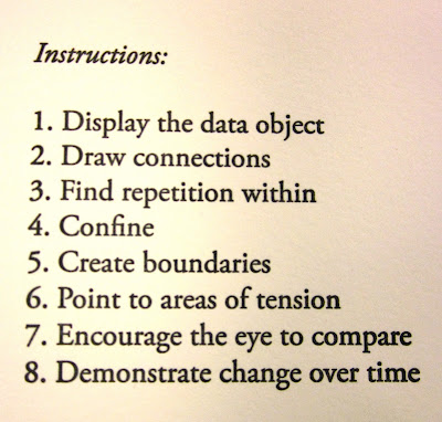
Ahoy! My first book project at The Press! Not only did I discover that I can't get enough of teal and red together, I also discovered how incredibly satisfying it is to print a book. I spent second block of this school year investigating some of the fundamentals of design, particularly digital design techniques. The majority of the block was spent messing around on photoshop and illustrator, trying some of Ellen Lupton's assignments from Thinking with Type. I also dilligently worked in a sketchbook, using a method for developing an idea that I lifted from Nadine Nakanashi of Sonnenzimmer in her artist book called Formal Additive Programs. In Formal Additive Programs, Nadine gives herself 18 Instructions: abstract verbal cues in order to proceed from one drawing to the next. These instructions include "Continue Motion & Move Freely," "Isolate, Observe and Compare" and "Listen to the Rhythm of the Patterns." Her drawings thoughtfully respond to these prompts and the book and ultimately generate a body of images that could be used as jumping off points for other projects. I found that if my initial drawing wasn't that great, it didn't matter because the third or fourth mutation was something completely abstracted from the first. For me, there was a good balance between relinquishing control, following instincts and trusting my internal dialogue.

After a few weeks of doing sets of these exercises every morning, I found a series of these that I liked enough to make into a letterpress book, hence Graphical Objectives came together. I found I was thinking a lot about graphs, maps and diagrams as visually gripping objects for their formal qualities rather than the information they conveyed. I also perused The Visual Display of Quantitative Information by Edward Tufte which discussed the theory and practice of data graphics. Here are some of the examples of my own formal additive programs from my sketchbook:


With a lot of help and patience from Aaron, I began to lay out, print and bind the book. Graphical Objectives was printed on our beloved Vandercook-219 over block break (during which I listened exclusively to Andrew Bird.) Amazingly, there weren't any huge snafus or "OH SHIT!" moments, which I had definitely anticipated. Registration, particularly on the last page was tight, but not too many pages were lost to mistakes. If I could print it again, I would err on the side of more ink and be more careful about the placement of the first page so that the teal wouldn't come through onto the fourth page.

Four months later, I am still incredibly psyched on this book and plan on making more. It was great to mail it to friends and family, and watch them read it. A lot of the recipients read the instructions, gave me a puzzled look, flipped through the book quickly, went back to the instructions and went through again more slowly. It was interesting to be able to compel almost every reader to go through it twice.

Recently, I read an essay by Karl Young, (not to be confused with called Carl Jung) "Notation and the Art of Reading" in which he discusses Aztec, Chinese and Early English ways of reading. He notes that early Chinese readers "in writing or reading poetry...tend to be much more attuned to the interworkings of sound, sight, gesture and idea. The interaction of components emphasizes continuity and versatility; a mind trained to read interwoven pictograms, graphs of gesture, phonograms and ideograms can be expected to feel a continuity between sight, sound, gesture and intellection." (Young, p. 33) This idea relates to the concept I had in mind for how readers might look at my book - written instructions that visually move from one graphic to another continuously, linking sight, intellection and intuition.

Headiness aside, I still can't beat my grandpa's comment over the phone the other day: "I don't know what it means, but I like touching it!"

Karl Joung, "Notation and the Art of Reading," A Book of the Book: Some Thoughts & Projections About the Book & Writing, ed. Steve Clay and Jerome Rothenberg (New York: Granary Books, 2000), 33

Friday, December 10, 2010

DAVID QUAMMEN

Originally posted by Katie Montgomery on 12/19/2009.

On December 7th esteemed author David Quammen came by the press to sign copies of "The Same River Twice", a book Colin had printed in honor of his visit. David has an enviable job and regaled us with stories of his adventures researching articles for National Geographic and trekking through the desert.

The book was printed in an edition of 60, the type is Dante, and the papers are Gutenberg Laid and Fabriano. Colin had a great deal of fun creating the wildly textured background for the cover.

A copy of the book (the insect on the front is a stonefly featured in the printed chapter).


The title page with the author's signature below.


The title page with the author's signature below.


A copy of the pamphlet created to celebrate and emphasize dear old Darwin.

Tuesday, December 7, 2010

CHRISTIAN BÖK

Originally posted by Katie Montgomery on 11/02/2009.

Christian Bök, top poet of the cold reaches of Canada, did a reading at Colorado College on the 15th of October 2009. To celebrate his visit Colin printed a pamphlet of "Voyelles," a poem by Arthur Rimbaud translated by Christian Bök. With everlasting class and cleverness Colin selected the imagery thusly: the cover features a print of all the capital vowels rotated around a central axis. Nerdy? Yes. Cool? Absolutely! For those of you who don't speak french "voyelles" means "vowels" which are the subject of the poem. The first line goes "A black, E white, I red, U green, O blue: the vowels." The back of the pamphlet is printed with five small rectangles, one in each color. Oh how minimalist and elegant. They were printed in an edition of 90 and are available for purchase at the price of $15. Contact [Aaron] to set up getting a copy!

UPDATE on 2/13/15: Voyelles is now OUT OF PRINT.

Aaron Cohick
The Press at Colorado College
14 E Cache la Poudre St
Colorado Springs, Co 80903
719.389.6376
aaronDOTcohickATcoloradocollegeDOTedu


The inside en francais (the english is on the facing page).

Capitalized vowels rotated around a central axis.