Showing posts with label Poster Press. Show all posts

Thursday, February 16, 2017

CALL FOR ENTRIES! AMPLIFY & MULTIPLY: RECENT PRINTED ACTIVIST EPHEMERA

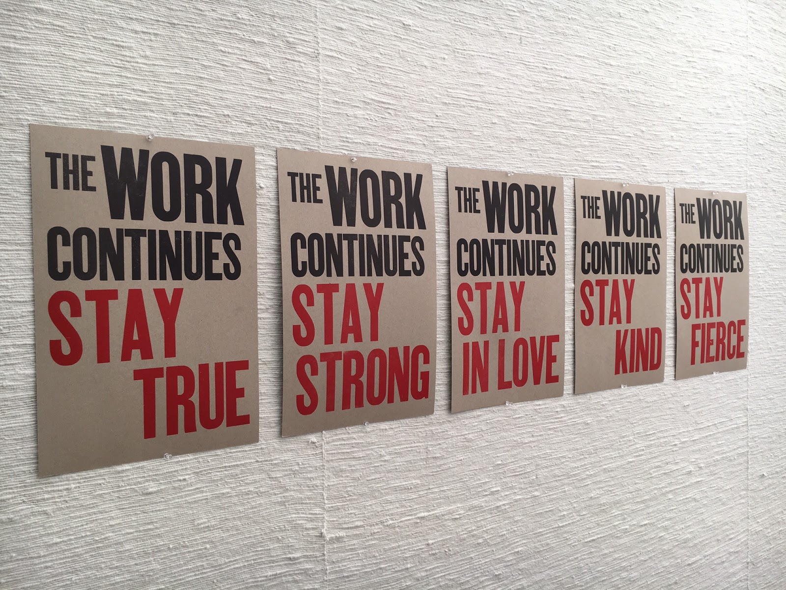
5 of 6 prints from The Continuing Project, by The Press at CC. Available here. 

CALL FOR ENTRIES! PLEASE SHARE WIDELY!
 
AMPLIFY & MULTIPLY: Recent Printed Activist Ephemera

IMPORTANT DATES:
Sign-up Deadline: February 24, 2017
Arrival Deadline: March 16, 2017
Exhibition Dates: March 27 – April 17, 2017
Reception: Friday, March 31, 2017, 4 - 6 pm
Return Shipment: April 25, 2017

AMPLIFY & MULTIPLY will be an exhibition of activist/social/political printed posters, protest signs, objects, fundraiser publications, and other ephemera, made in (roughly) the last 6 months, advocating for social and environmental justice, equality, and the rights of oppressed people. This is a show that will stand in opposition to fascism, racism, white supremacy, misogyny, and every other horrible tool that power uses to maintain its killing grip. We are looking for work that has been deployed in the real world, as opposed to being made just for this show. This show is not limited to professional artists. It is open to anyone who has felt compelled by recent events to produce and share a message in the print medium.

The show will be held in Colorado Springs, at Colorado College’s Coburn Gallery, from March 27 to April 17, 2017.

IMPORTANT: As this is a show of ephemera, we are not planning on returning the pieces. If you want your pieces returned, you must notify us in advance and use reusable packaging that includes a return shipping label. All of the work that we keep at Colorado College will be housed in a permanent archive in Tutt Library’s Special Collections, accessible to students and the general public.


GUIDELINES:
Please email Aaron Cohick at aaron.cohick@coloradocollege.edu if you are going to participate, and please also note if you can donate your pieces or if you would like them returned. The deadline for sign-ups is February 24, 2017.
  • All work must be printed (letterpress, screenprint, offset, digital, Riso, etc.). We will not exhibit hand-lettered signs.
  • Send as many pieces as you like. Multiple copies are great and will all be displayed if there is space.
  • Work should have been made since August of 2016, but that is flexible. Definitely nothing before 2016.
  • No fee. No jury. No sales. No trolls.
  • Artists are responsible for shipping costs to and from Colorado College. See “Shipping” below for more info.
  • Unframed works/objects only
  • The exhibition will be hung salon-style, using binder clips hung on push pins.
  • Objects that are not posters (like tote bags, buttons, etc.) are definitely encouraged.
  • Artwork will not be insured by Colorado College during transit or while on site.

SHIPPING:
Send work to:


Aaron Cohick
The Press at Colorado College
14 E. Cache La Poudre St.
Colorado Springs, CO 80903

Please write “Amplify Show” on the labels or packages.

REMINDER: If you want your pieces returned, you must use reusable packaging and include a return shipping label.

CONTACT:

Aaron Cohick, Printer of The Press at Colorado College 
aaron.cohickATcoloradocollegeDOTedu

From A People's Curriculum for the United States, by Cuneiform Press

Friday, July 13, 2012

POSTERS SO FAR

Last year I wrote about the first letterpress poster I ever made here. Since then I have printed many more posters, even as I spent last semester away from Colorado College and the press. As I go into this school year with new ideas and fresh perspectives, I would like to first reflect on my posters so far: the trials, tribulations, and successes of printing a poster the letterpress way.


This was my second poster and is still one of my favorite designs. Type and image mesh well and I got a few things right by chance, like type sizes and ink colors. It was a three-color poster with wood type, lead type, and two different linoleum blocks. Abe is a little more purple in person. It was also my most frustrating poster, by far. Somewhere in the translation from email to paper to design to type, I mistook the speaker's last name "Chiras" for "Chiaras". I didn't realize until the poster client called and told me the 70 posters I just delivered had a rather unacceptable typo. LETTERPRESS LESSON NUMBER ONE: PROOF-READ AGAINST THE ORIGINAL SPECIFICATIONS AND THEN PROOF-READ AGAIN. Nothing like a ten-hour all-nighter at the press to build character!


This was my next poster and the first of the school year. I printed it within the first four days of being back at school, probably my fastest poster ever. I was quite happy with the final design, the one thing I would change the shade of the blue ink: it isn't as legible from long distances as I would like, and it's too soft against the dark red. Printing this poster I learned that when working with metal type, printing is much easier if you set all the lines to the same width using extra spacing. The lock-up (how the type is placed in the press bed) can get very complicated if your lines are all different lengths.


This was my first and only poster using photopolymer plates. Although I enjoyed designing and printing with photopolymer, it is not a very cost-effective method. This is a three color poster (dark blue, black, and silver on a light gray-blue. To get the design I traced a map of the colorado river basin, fiddled with it in the Adobe Creative Suite, added text, and separated the image into three layers which would become my three colors (with the help of Aaron). I loved being able to see the image on the computer before making the plates and printing: it allowed me to make the text all the optimal size and have the optimal placement, something I still struggle with when setting lead type by hand. I also took advantage of the ability to create negative text. Although the design process took longer than it would with type and linoleum, doing the lock-up and printing was a breeze. Definitely one of my favorite results.


For this poster I used a mix of lead type, a linoleum reduction cut, and wood type placed upside-down. I had really wanted to try upside-down wood type, but it may have distracted from thinking about the poster design as a whole because this design is my weakest, in my opinion. There is too much white space and the ink colors are all wrong. If I did it again I would set the title type in a larger size, make both the blue ink colors darker, and use some of the orange/pink florescent ink for the text. (I unfortunately didn't know we had florescent ink at this point).


This poster was a sort of rebellion against the last and I had a lot of fun with it. Printers-in-training Mariel Dempster and Julia Belamarich helped during the designing, type-setting, and printing which was very appreciated: having people to bounce ideas off definitely makes the final product better. This was a two-color poster: bluish-black and silver on yellow paper. It incorporated lead and wood type, like my first two posters, and a reduction linoleum cut. If I did the State of the Rockies Speakers Series again (the client for my last five posters) I would have liked to use the line of wood type at the top in all of them, to make the series more cohesive. I think it's a strong, attention-grabbing template and quite versatile.


This is the poster I ended on, before I took a poster and press hiatus after the fall semester. Although it was a simple two-color linoleum and lead type poster, it was a good note to end on. The texture of the linoleum cut turned out well and these colors on the chip board gives an earthy, subtle feel that goes well with the design and the text.

This year I'll printing some of the Visiting Writers Series, using turn of the century book covers as inspiration for layouts. I couldn't be more excited to jump back into the world of keys and quoins (Use that in your next game of scrabble. You're welcome.)

Wednesday, June 15, 2011

2010 – 2011 POSTER ROUND-UP, PART 1

Here are images of some of the posters that we printed this year—everything that we have photos of so far (we did more than 20 this year). They’re presented in (roughly) chronological order, with the artist’s name and the medium underneath (they’re all letterpress printed, but using various techniques to make the matrices). The posters are normally designed and printed by the students, but I occasionally do some to handle overflow or really tight deadlines.


Poster by Aaron Cohick
Lead & wood type, found cuts


Poster by Aaron Cohick
Lead & wood type, found cuts


Poster by Aaron Cohick
Image by Dave Armstrong
Photopolymer plates, printed in a variable edition. Three different posters are shown in the second image.


Poster by Eleanor Anderson
Photopolymer plates


Poster by Eleanor Anderson
Reduction linoleum cut, printed in a variable edition with silver and blue lettering


Poster by Taryn Wiens
Lead & wood type, reduction linoleum cut


Poster by Eleanor Anderson
Photopolymer plates

Wednesday, April 27, 2011

LETTERPRESS IN ACTION!!!

One of the most visible things the Press at CC does for the campus & community is design and print posters for events. All of the posters are designed and printed by our student apprentices. Here's a shot of a brand new one, frolicking in its natural environment, happily living its print-life. It was made by Becca Levi.

Tuesday, March 1, 2011

KEEP EXPLORING

This semester I got to print my first poster, ever, at the press. (!) It was for Steven Hayward's literature class in Canada this summer. I printed seventy posters (with some extras) in four runs using three colors. I set 'KEEP EXPLORING' in wood type, which I'd never used before but always wanted to. I set it to touch the edges of an 11x17 inch poster. The rest of the text I set in lead type, Times New Roman and Goudy. To keep the ink levels consistent I printed the large type in one run and the small type in the next run. To frame the text from the top and bottom I used a reduction linoleum cut mounted on wood. Using pictures of Canada mountains I carved two mountain skylines, printed them in blue, then carved the skylines of Toronto and Montreal and printed them in green.

I used the Asbern press, the smallest one we have. It caused some momentary stress when I started printing the green skyline and realized the packing (which backs the paper as it runs through the press) was dropping off an inch before the end of the poster...you can't actually print all the way down the press bed on that press because the packing ends well before it. I fixed the problem by cutting the block with the linoleum in half (it was originally mounted on one block of wood) and moving the bottom block up by about an inch. The poster ended up being a little shorter than I had planned, but it's not very noticeable and doesn't really take away from the poster as a whole I think.

First and second runs

Third and fourth runs

Final poster, linoleum cut, original sketch

If I could do the poster over, I would switch to a bigger press and definitely set the chunks of text moving from left-aligned gradually to right-aligned to better activate the inside space of the poster. I would also use less fonts. I think it went well though, for my first poster. I'm excited to do more!

Sunday, February 27, 2011

NUNZ


Commissioned by Carol Neel in the History Department at Colorado College, this poster was for speaker Mary Ann Hinsdale, professor of theology at Boston College, speaking about the disappearance of nuns in the Catholic Church. This poster was my first poster using all polymer plates, and the smallest poster I made so far. Inspired by Andy Warhol's screen print of Ingrid Bergman as a nun, I wanted to make the image of the nun as graphic as possible, and use bright colors that aren't usually associated with nuns. Another source of inspiration was typographer Isaac Tobin (an internet fav of mine) His style is simple, crisp and clear and I tried to emulate his style for the type lay-out of this poster.

During the printing process, I was a little nervous about the EXTREME VIBRANCY of the colors, and, additionally, that the colors were the exact colors of the Denver Broncos. (yikes) After the orange, blue and dark blue were printed, I wandered over to the print shop to get some other eyes on it. Luckily, Heather Oakleaus, photography teacher, was around and plopped a barbie doll down on my poster and said "throw some HOT PINK ON IT." Moral of the story: What Would Barbie Do? Go BIG or go HOME! The nuns giving the speech loved the poster and grabbed all they could before heading home.

Another thing to consider about this poster, was the fact that the nuns have X's over their eyes, and these posters were going up in churches all over Colorado Springs (again, yikes?) Although this poster could have been potentially controversial, I learned that sometimes, over-doing it works. The image is eye-catching and funny and the colors are saccharine but stand out on a busy bulletin board. If I could do this poster over, I would have built in trapping in the polymer so that slight registration errors weren't noticeable.


Thursday, February 24, 2011

FUNK FACE AT THE CARRIAGE HOUSE

For this project, I made an edition of 31 posters, 10"x 20". The event is a student band (FUNK FACE!) playing live at the Morreale Carriage House on Friday the 25th at 10pm. Sponsored by The Sound of Colorado College Student Radio Station.
Above: Top: Printing the first color, and essentially laying the foundation for the poster in red. Photo taken by my assistant--Daniel Alvarado.
Above: Bottom: Printing the 2nd color: brown. On the left is the lock down on the press bed, on the right is the product hot off the press.

Carving for the third run. This is mid-carving, when I was done the block looked mostly lighter--this was in an attempt to shade the edges of the lines with the third color (dark purple) to add depth and movement.


Playing around with margin size and formatting. So many choices! Final poster is the one on the far right.
Above: all three stages of the poster. From right to left you can see the red, brown, and finally the purple phases of the image. This poster was done using linoleum blocks, and utilizes what is called a 'reductive' printing process, this meaning as I printed each run (or in this case, each color) I carved away more and more of the block. You can see in the first few images, I started out with solid red blocks to lay a base color, and then in the sixth image, that I was on my second stage of carving. There is one sentence of type at the bottom, set by hand in Nubian typeface, size 14, which was printed on the third run in purple. So in between each run, I went back to the carving block and changed where the press was going to lay down ink--for a grand total of three runs and two carving sessions!

Wednesday, December 8, 2010

THE MAKING OF A POSTER

Originally posted by Katie Montgomery on 11/06/2009.

Emma Mitchell has been working on a poster to advertise visiting writer Bonnie Nadzam. The following is a bit of a photo essay documenting poster printing (significantly lacking a few stages such as a preliminary sketch, setting the type, and printing the image. Whoops) with Emma!

Carving the organic filigree design she created for the poster.


The second print. Emma originally went for a grass green text but had to abandon it (sigh) because the text overlapped with the filigree and wasn't readable. Thus a switch to deep midnight blue. The look of mild bewilderment is no doubt caused by my taking her picture. For those of you who are interested, this is what a locked up press looks like when the type is inked and you're ready to roll!


Mixing colors is a bit of an art. The ink is extremely concentrated so the ratios are very important. In the end you often try a number of mixes before you find a hue that's juuust right.


Jody looks on while Emma Prints. Nobody No-how No-way is allowed to print without the presence of a monitor. We really hate it when people get fingers or sleeves or braids caught in the press and there ain't no-one around to give them a hand. Plus, despite the fact that a Vandercook weighs a couple thousand pounds and looks like a beast, you gotta baby it a little.


The finished product!