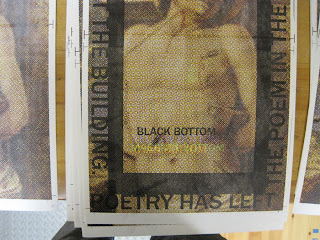
The other big “?” of this project was the delamination: a process of cutting into (but not through) the sheet of paper and peeling away its surface. I have done a fair amount myself (in books and broadsides) but I have never asked anyone to help me (though I have taught it and seen those students succeed at it). But it is tedious. And strange. And this was the first large project that I was asking my new apprentices to help with. I would not have been surprised had there been a mutiny. One mistake I did make in planning was not realizing how slow the process goes when someone is first learning. But our brave crew stuck to it, and we completed the edition.
Showing posts with label Darren Wershler. Show all posts
Showing posts with label Darren Wershler. Show all posts
Friday, August 26, 2011
“POETRY HAS LEFT THE POEM” BROADSIDE: PHASE COLOPHON
The explanation really doesn’t require an explanation:
This was printed centered, towards the bottom of the reverse side, in 12 pt. Centaur.
This was printed centered, towards the bottom of the reverse side, in 12 pt. Centaur.
Labels:
Broadsides,
Darren Wershler,
Printing,
Process Notes
“POETRY HAS LEFT THE POEM” BROADSIDE: PHASE TEXT
After the image was complete, the next step was to print the text over the image, so that the outlines to delaminate would already be on each print. Like the image, the text had to be printed in two sections:
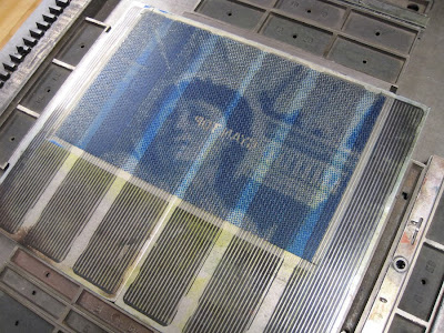
[A brief aside: Some of you printers out there might be wondering why a plastic-backed photopolymer plate is mounted on a magnetic base (made for steel-backed photopolymer). Because those are the bases that we have. We do have one Boxcar base, but it’s only a 9” x 12”. We have the advantage of having two presses with adjustable beds, so the plates can easily be raised to the proper height. We have also stuck pieces of paper under the magnetic bases to raise them up on the non-adjustable presses. So those magnetic bases are still useful, even if you’ve switched entirely to plastic-backed plates.]
I first tried printing the text in opaque white, because I was afraid black or another color wouldn’t have enough contrast. I was wrong. Here’s what the white looked like:
So black again, and it worked much better:
Labels:
Broadsides,
Darren Wershler,
Printing,
Process Notes
“POETRY HAS LEFT THE POEM” BROADSIDE: PHASE K
And then “K” for the key color, in this case (as in most cases) black.
In the two images below, the top image shows the top half of the print without the black layer, and the bottom half with. The black becomes just enough of a presence to provide the structure of the image. The second image shows the top half of the print with the black layer.
And somehow that full image is also this:
Labels:
Broadsides,
Darren Wershler,
Printing,
Process Notes
Wednesday, August 24, 2011
“POETRY HAS LEFT THE POEM” BROADSIDE: PHASE M
And then, you guessed it, magenta! The difference between the yellow+cyan and the yellow+cyan+magenta is extraordinary.
Labels:
Broadsides,
Darren Wershler,
Printing,
Process Notes
Tuesday, August 23, 2011
“POETRY HAS LEFT THE POEM” BROADSIDE: PHASE Y

And of course another thing was that I had never attempted a CMYK letterpress print before. But I figured this was a good chance to experiment, as the fidelity of the final image wasn’t going to matter. The important thing was for the remaining areas to have that CMYK dot pattern.
So I jumped right in.


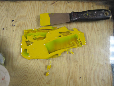
And it quickly became clear that four-color process printing was mostly a matter of faith. I decided to match the ink to the Pantone swatch and hope for the best.

Labels:
Broadsides,
Darren Wershler,
Printing,
Process Notes
“POETRY HAS LEFT THE POEM” BROADSIDE: DESIGN
This summary is not available. Please
click here to view the post.
Labels:
Broadsides,
Darren Wershler,
Printing,
Process Notes
Subscribe to:
Posts (Atom)


