Showing posts with label Process Notes. Show all posts

Friday, July 13, 2012

POSTERS SO FAR

Last year I wrote about the first letterpress poster I ever made here. Since then I have printed many more posters, even as I spent last semester away from Colorado College and the press. As I go into this school year with new ideas and fresh perspectives, I would like to first reflect on my posters so far: the trials, tribulations, and successes of printing a poster the letterpress way.


This was my second poster and is still one of my favorite designs. Type and image mesh well and I got a few things right by chance, like type sizes and ink colors. It was a three-color poster with wood type, lead type, and two different linoleum blocks. Abe is a little more purple in person. It was also my most frustrating poster, by far. Somewhere in the translation from email to paper to design to type, I mistook the speaker's last name "Chiras" for "Chiaras". I didn't realize until the poster client called and told me the 70 posters I just delivered had a rather unacceptable typo. LETTERPRESS LESSON NUMBER ONE: PROOF-READ AGAINST THE ORIGINAL SPECIFICATIONS AND THEN PROOF-READ AGAIN. Nothing like a ten-hour all-nighter at the press to build character!


This was my next poster and the first of the school year. I printed it within the first four days of being back at school, probably my fastest poster ever. I was quite happy with the final design, the one thing I would change the shade of the blue ink: it isn't as legible from long distances as I would like, and it's too soft against the dark red. Printing this poster I learned that when working with metal type, printing is much easier if you set all the lines to the same width using extra spacing. The lock-up (how the type is placed in the press bed) can get very complicated if your lines are all different lengths.


This was my first and only poster using photopolymer plates. Although I enjoyed designing and printing with photopolymer, it is not a very cost-effective method. This is a three color poster (dark blue, black, and silver on a light gray-blue. To get the design I traced a map of the colorado river basin, fiddled with it in the Adobe Creative Suite, added text, and separated the image into three layers which would become my three colors (with the help of Aaron). I loved being able to see the image on the computer before making the plates and printing: it allowed me to make the text all the optimal size and have the optimal placement, something I still struggle with when setting lead type by hand. I also took advantage of the ability to create negative text. Although the design process took longer than it would with type and linoleum, doing the lock-up and printing was a breeze. Definitely one of my favorite results.


For this poster I used a mix of lead type, a linoleum reduction cut, and wood type placed upside-down. I had really wanted to try upside-down wood type, but it may have distracted from thinking about the poster design as a whole because this design is my weakest, in my opinion. There is too much white space and the ink colors are all wrong. If I did it again I would set the title type in a larger size, make both the blue ink colors darker, and use some of the orange/pink florescent ink for the text. (I unfortunately didn't know we had florescent ink at this point).


This poster was a sort of rebellion against the last and I had a lot of fun with it. Printers-in-training Mariel Dempster and Julia Belamarich helped during the designing, type-setting, and printing which was very appreciated: having people to bounce ideas off definitely makes the final product better. This was a two-color poster: bluish-black and silver on yellow paper. It incorporated lead and wood type, like my first two posters, and a reduction linoleum cut. If I did the State of the Rockies Speakers Series again (the client for my last five posters) I would have liked to use the line of wood type at the top in all of them, to make the series more cohesive. I think it's a strong, attention-grabbing template and quite versatile.


This is the poster I ended on, before I took a poster and press hiatus after the fall semester. Although it was a simple two-color linoleum and lead type poster, it was a good note to end on. The texture of the linoleum cut turned out well and these colors on the chip board gives an earthy, subtle feel that goes well with the design and the text.

This year I'll printing some of the Visiting Writers Series, using turn of the century book covers as inspiration for layouts. I couldn't be more excited to jump back into the world of keys and quoins (Use that in your next game of scrabble. You're welcome.)

Tuesday, August 30, 2011

BEGINNING FICTION: TWICTION (1)


When last year’s visiting Press lecturer, Darren Wershler (see the posts below for the project that we did with him) gave his talk, he brought up many interesting and provocative ideas in regard to the future of the book and various forms of web-based publishing. He talked about writing constructed through the use of Google and other software, QR codes, and Twitter and other social media, and how these new modes of textual generation and distribution are affecting the practice and role of writing.

Shortly after that lecture, Steve Hayward’s Beginning Fiction class, who had been at the lecture and participated with other parts of Darren’s visit, came to The Press to learn and do a project. They decided that they wanted to respond to Darren’s lecture somehow, to use it as the basis for whatever they did at The Press—a little old + new media.

They had already written some Twitter-length fiction (Twiction: stories containing no more than 140 characters—an extreme, media dictated form of flash fiction) and wanted to use that as the text for the project. But how could Twitter and letterpress printing fit together? The answer came in the most ubiquitous link between the physical world and the web: the QR code. The printed QR code could literally be the (hyper)connection between the physical mode of text distribution (a book) and the electronic mode of distribution (in this case, a Twitter account set up to publish their Twictions). Scanning the QR code took a reader to the Twitter page of the class. The QR code became both the aesthetic and the conceptual driver of the project.

[Aside: one of the central tenets for structuring these class projects is that the students are given as much control and ownership as possible—both what to do and how to do it. I always give feedback on their ideas and help to guide them in terms of what is possible and what is feasible, but ultimately these Penny Press projects are conceived and executed by the students.]

We also decided to augment our hyper-project with that oldest form of social media: the letterpress printed broadside. We designed a poster that was made up of the QR code, the Twitter URL blind stamped at the bottom (for those without smart phones), and the actual text of the Twictions, also blind stamped, printed directly on top of the QR code. The blind-stamping allowed the QR to remain functional. These broadsides would be hung all over campus, with no explanation beyond the information encoded in them, as a real world, guerrilla expansion of the project.


Printing the QR codes on the book covers.


Blind stamping on the book cover.


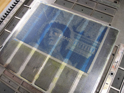
The polymer plate for the QR Code.


Printing the QR codes on the broadsides.


Friday, August 26, 2011

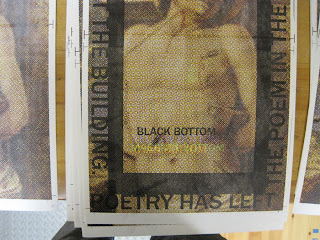
“POETRY HAS LEFT THE POEM” BROADSIDE: PHASE DELAMINATION

The other big “?” of this project was the delamination: a process of cutting into (but not through) the sheet of paper and peeling away its surface. I have done a fair amount myself (in books and broadsides) but I have never asked anyone to help me (though I have taught it and seen those students succeed at it). But it is tedious. And strange. And this was the first large project that I was asking my new apprentices to help with. I would not have been surprised had there been a mutiny. One mistake I did make in planning was not realizing how slow the process goes when someone is first learning. But our brave crew stuck to it, and we completed the edition.


“POETRY HAS LEFT THE POEM” BROADSIDE: PHASE COLOPHON

The explanation really doesn’t require an explanation:


This was printed centered, towards the bottom of the reverse side, in 12 pt. Centaur.

“POETRY HAS LEFT THE POEM” BROADSIDE: PHASE TEXT

After the image was complete, the next step was to print the text over the image, so that the outlines to delaminate would already be on each print. Like the image, the text had to be printed in two sections:


[A brief aside: Some of you printers out there might be wondering why a plastic-backed photopolymer plate is mounted on a magnetic base (made for steel-backed photopolymer). Because those are the bases that we have. We do have one Boxcar base, but it’s only a 9” x 12”. We have the advantage of having two presses with adjustable beds, so the plates can easily be raised to the proper height. We have also stuck pieces of paper under the magnetic bases to raise them up on the non-adjustable presses. So those magnetic bases are still useful, even if you’ve switched entirely to plastic-backed plates.]

I first tried printing the text in opaque white, because I was afraid black or another color wouldn’t have enough contrast. I was wrong. Here’s what the white looked like:


So black again, and it worked much better:


“POETRY HAS LEFT THE POEM” BROADSIDE: PHASE K


And then “K” for the key color, in this case (as in most cases) black.


In the two images below, the top image shows the top half of the print without the black layer, and the bottom half with. The black becomes just enough of a presence to provide the structure of the image. The second image shows the top half of the print with the black layer.


And somehow that full image is also this:


Wednesday, August 24, 2011

“POETRY HAS LEFT THE POEM” BROADSIDE: PHASE M


And then, you guessed it, magenta! The difference between the yellow+cyan and the yellow+cyan+magenta is extraordinary.


Tuesday, August 23, 2011

“POETRY HAS LEFT THE POEM” BROADSIDE: PHASE C

And then the cyan. The image started to come through, but the color still looked rather bizarre….